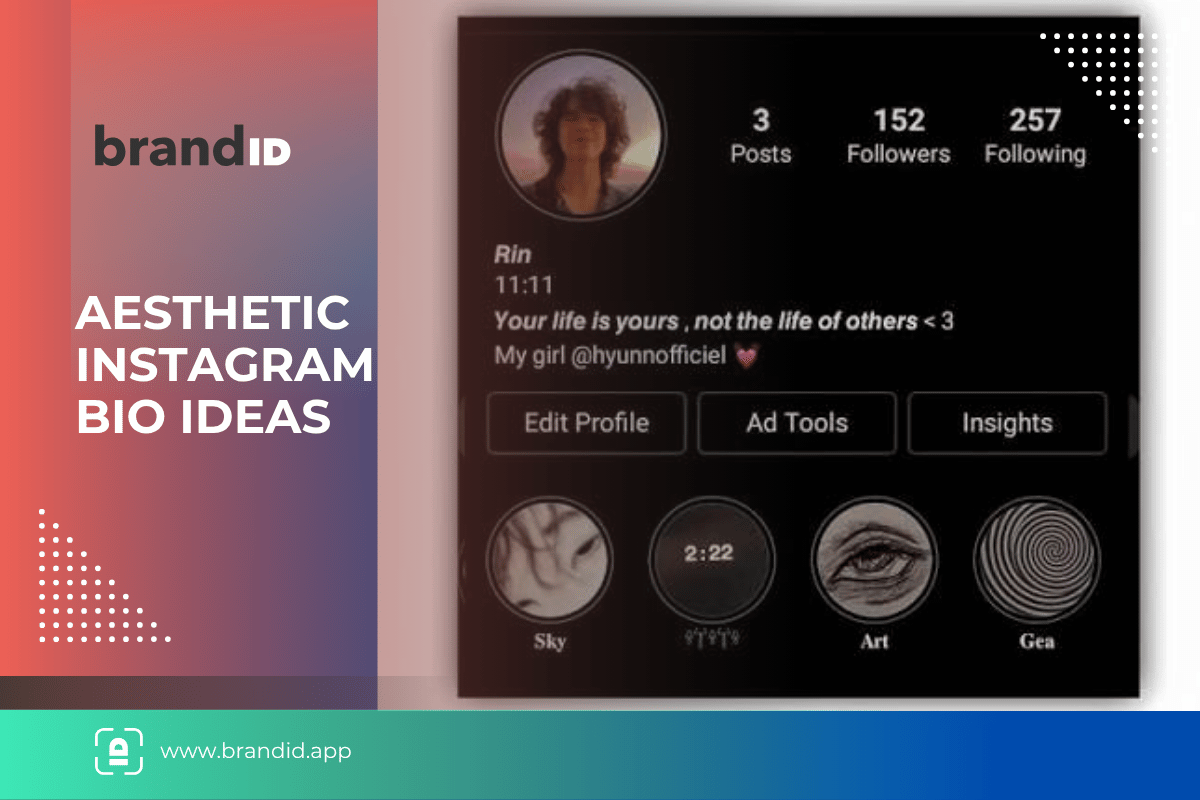
Here is something no list of aesthetic Instagram bio ideas mentions: the pretty fonts cost you half your bio.
Those script and double-struck letters are not fonts. They are separate Unicode characters that sit outside the standard range, and Instagram counts each one as two characters rather than one. A 150-character bio written in script gives you about 81 characters of visible text.
That is worth knowing before you build something you then have to cut in half. Below are 90+ original aesthetic bios you can copy, a symbol library to build your own, and the two font styles that give you the look without the character penalty.
If you want lines rather than layouts, the best Instagram bio ideas cover the plain-text approach.
Table of Contents
ToggleKey Takeaways
Key Takeaways
- Script and double-struck fonts cost 2 characters each, cutting a 150-character bio to about 81 visible characters
- Small caps and fullwidth text are free. They sit in the standard character range and count as one each
- Line breaks count as characters too, so a five-line layout spends five of your 150 before any words
- Type it in your notes app and paste it in, because line breaks entered directly are unreliable
- Styled fonts break name search. Somebody typing your name in plain letters will not match your bio
- Screen readers read styled text character by character or skip it, so keep one plain line for accessibility
- Put the decoration around your words, not through them, which gives you the aesthetic and keeps the meaning
What Aesthetic Fonts Actually Cost You
Every aesthetic bio guide hands you styled text without mentioning the tradeoff. There are three, and the first is measurable.
The Character Penalty
Instagram allows 150 characters. Styled letters like 𝓪 and 𝕒 are encoded outside the standard range and count as two, so a script bio reaches the limit at roughly half the length.
| Style | Example | Cost per letter | Visible characters in a 150-char bio |
|---|---|---|---|
| Plain text | coffee and calm | 1 | 150 |
| Small caps | ᴄᴏꜰꜰᴇᴇ ᴀɴᴅ ᴄᴀʟᴍ | 1 | 150 |
| Fullwidth | coffee and | 1 | 150 |
| Bold script | 𝓬𝓸𝓯𝓯𝓮𝓮 𝓪𝓷𝓭 𝓬𝓪𝓵𝓶 | 2 | About 81 |
| Double-struck | 𝕔𝕠𝕗𝕗𝕖𝕖 𝕒𝕟𝕕 𝕔𝕒𝕝𝕞 | 2 | About 81 |
| Typewriter | 𝚌𝚘𝚏𝚏𝚎𝚎 𝚊𝚗𝚍 𝚌𝚊𝚕𝚖 | 2 | About 81 |
| Fraktur | 𝔠𝔬𝔣𝔣𝔢𝔢 𝔞𝔫𝔡 𝔠𝔞𝔩𝔪 | 2 | About 81 |
Symbols and dividers are mixed. Most stars, dots and box characters cost one, while emoji almost always cost two.
💡 Test it before you write the whole thing:
Paste a draft into the bio field and watch the counter. If 40 visible characters registers as 80, you are using an expensive style and should plan the layout around it rather than discovering the problem at line four.
Search and Accessibility
Styled letters are not the letters they look like. Somebody searching your name in plain text will not match a bio written in script, and Instagram’s search relies on that matching.
Screen readers handle them badly too, either reading each character separately or skipping the line. One plain-text line in your bio solves both problems.
How to Add Line Breaks to an Instagram Bio
Every layout below depends on line breaks, and typing them directly into the bio field is unreliable. Instagram sometimes strips them when you save.
- 1- Open your notes app and write the bio exactly as you want it to appear, with real line breaks.
- 2- Select and copy the whole thing, including the blank lines if you used any.
- 3- Paste it into the bio field in Edit Profile rather than typing it in.
- 4- Save immediately and check the result on your profile before editing anything else.
- 5- Count the lines against your budget, because each break costs a character from the same 150.
1- Aesthetic Instagram Bio Ideas
The strongest all-rounders, using symbols for structure and keeping the words in plain text so they stay searchable.
collecting quiet mornings
and slightly better coffee
˖ ⁺ ‧ ୨ ୧ ‧ ⁺ ˖
· ୨୧ · slow living, loud thinking
· ୨୧ · always somewhere green
↳ link below
documenting small things
before they stop being new
└─────── ⋆⋅☆⋅⋆ ───────┘
⊹ ˚ . ⋆ mostly on purpose
⊹ ˚ . ⋆ occasionally on time
here for the long version
✦ · · · · · · · · · · ✦
soft heart, sharp edits
﹒⋅ ୨୧ ⋅﹒
2- Celestial and Moon Aesthetic Bios
The most claimed aesthetic on the platform, which means the vocabulary matters. These skip moonchild and stardust for something less used. Faith-led accounts face the same crowding problem, which the Christian Instagram bios solve with references rather than quotations.
awake at the wrong hours
on purpose
⋆ ˚ 。 ⋆ ୨ ☾ ୧ ⋆ 。 ˚ ⋆
⋆ closest in january
⋆ furthest in july
⋆ still orbiting
counting light that left
before I was born
☾ · ✦ · ☽
the clouds that only
show up after dark
₊ ⊹ ⊹ ₊
· 3am thoughts, 3pm energy
· link below
3- Nature and Forest Aesthetic Bios
Nature words are heavily picked over, so these reach for specifics rather than the general vocabulary of leaves and trees. If the account moves rather than stays put, a travel bio for Instagram has a maintenance problem this one does not.
chickweed, sorrel, yarrow
learning what grows here
❀ ⌇ ❀ ⌇ ❀
⌗ elderflower in june
⌗ damsons in september
⌗ nothing in january
outside more than in
muddier for it
✿ · ─ · ✿ · ─ · ✿
ᨒ slow woods, long light
ᨒ link for the walks
⊹ ࣪ ˖ bramble butter
⊹ ࣪ ˖ nettle everything
4- Ocean and Coastal Aesthetic Bios
Coastal bios work best when they mention the cold or the practicality, because everybody else is writing about waves.
in the water before seven
regretting it by ten past
≋ ≋ ≋ ≋ ≋ ≋ ≋ ≋
⟡ tide times in highlights
⟡ swimming year round
cold water, warm flask
same beach, different sea
◌ ⌇ ◌ ⌇ ◌
༄ small boats, long swims
༄ link below for the routes
5- Cozy and Autumn Aesthetic Bios
Cozy is the easiest aesthetic to do badly because the vocabulary is exhausted. Naming a specific object beats naming a feeling. Couples running two accounts can split one layout across both, which is the idea behind Instagram matching bios.
second pot of the morning
book face down on the arm
⌇ ⌇ ⌇ ⌇ ⌇ ⌇ ⌇
wool socks and slow sundays
◟ ୨୧ ◞
⊹ rain against the window
⊹ nowhere to be until four
one lamp, two blankets
three unfinished books
┈ ୨ ✦ ୧ ┈
6- Soft Girl and Pastel Aesthetic Bios
Soft works when it pairs gentleness with something concrete, since a bio made entirely of soft words says almost nothing. The same restraint drives the confident and flirty bios, where understatement consistently beats declaration.
soft in tone, firm in plan
♡ ⌒ ♡ ⌒ ♡
· pastel everything
· sharper than I look
· link below
𖹭 ⌇ gentle but not quiet
𖹭 ⌇ ask me about the tattoo
cotton halo, concrete plans
﹒♡﹒
7- Dark and Moody Aesthetic Bios
The dark aesthetic collapses into cliche faster than any other. Restraint is what keeps these from reading as a teenage forum signature. Borrowed intensity has the same problem in the motivational bios for Instagram, where the copied lines outnumber the original ones.
low light, low volume
high standards
▪ ▫ ▪ ▫ ▪ ▫ ▪
✦ film grain over clarity
✦ link below
overcast is the default
⊘ ⌇ ⊘ ⌇ ⊘
nine pm walks
empty car parks
︎▬▬▬▬▬▬▬▬
8- Minimalist Aesthetic Bios
The cheapest aesthetic in character terms and the hardest to get right, because there is nothing to hide behind. Some accounts have no choice about being plain, and an athlete bio for Instagram has to spend every character on information coaches need.
| finishing some
↳ link below
still just me
─────────────
⌁ done properly
⎯ no notifications
9- Spaced Out Text Bios
Letter spacing costs one character per space, which is cheap, and it reads as deliberate on almost any account. It also survives platforms with tighter limits, unlike the framed layouts, which is why the Twitter bio ideas lean on it heavily.
↳ f a s t d e a d l i n e s
♡ l o u d i d e a s
♡ l i n k b e l o w
e l s e w h e r e s o o n
↳ w r i t e r
↳ w a l k e r
↳ o c c a s i o n a l l y b o t h
10- Symbol and Divider Bios
Pure structure with almost no words. These work when the feed is doing the talking and the bio only has to frame it.
name here
˖ ⁺ ⁺ ˖ ✧ ˖ ⁺ ⁺ ˖
photography
┈┈┈ ୨୧ ┈┈┈
since 2019
⊹ ࣪ ˖ ⊹ ࣪ ˖ ⊹ ࣪ ˖
index of things I like
◟◞ ◟◞ ◟◞ ◟◞
Aesthetic Bio for Instagram to Copy and Paste
Aesthetic lines land harder with a few symbols around them. These come pre-styled with dividers and sparkles, so you can copy one and paste it straight in without hunting for characters.
11- Now Playing and Music Bios
The player mockup is the most copied layout in this category. It works because it is instantly recognizable, and it costs almost nothing in characters.
0:26 ─♡─────── 3:50
◁◁ ❚❚ ▷▷
track 01 · side b
0:00 ───◇──── 4:12
on repeat since tuesday
◁◁ ❚❚ ▷▷
♬ dm for collabs
0:14 ──◆────── 2:58
12- Loading Bar and Quirky Bios
Progress bars and status lines suit accounts with a sense of humor. They also read cleanly on every device, which the fancy fonts do not. For jokes carried by wording rather than layout, the funny Instagram bios go further.
sleep: [■■□□□□□□□□] 20%
coffee: [■■■■■■■■■■] 100%
battery: 12%
location: probably the kitchen
[■■■■□□□□□□] 40%
please wait
to: overthinking_5GHz
◌ link below
13- Acrostic Aesthetic Bios
Your name reading down the left edge. It takes a minute to build and almost nobody uses it, which is the whole appeal.
Ⓘ n a small room
Ⓐ nd sharing most of them
Ⓔ diting at midnight
Ⓞ ne project at a time
Ⓝ ever quite on time
Ⓐ sk about the garden
14- Kaomoji and Text Art Bios
Small figures made from punctuation. They cost more characters than they look like they should, so keep the rest of the bio short. Younger audiences expect this style as standard, and the Roblox bio ideas are built almost entirely from it.
here for snacks and sunsets
↳ link below
( . .) hi
( づ ♡
small account, big opinions
( = • · • = )
/ づ ♡
15- Aesthetic Bios for Girls
Beyond the aesthetic look, hundreds more by mood sit in our Instagram bio for girls ideas.
Softer in tone but built the same way, with the decoration around the words rather than through them.
her own project, always
⋆ ˚ 。 ⋆ ୨ ♡ ୧ ⋆ 。 ˚ ⋆
· becoming her, deliberately
· link below
♡ ⌇ kind, capable, busy
♡ ⌇ ask me anything
quietly outworking the doubt
﹒୨୧﹒
Broader options that are not layout-based sit in the Instagram bio ideas for girls.
16- Aesthetic Bios for Boys
For attitude and interest styles too, our Instagram bio for boys ideas go wider.
Drier and more structural. Fewer hearts, more lines, and considerably shorter.
quiet drift
north of plain
▪ ▪ ▪ ▪ ▪ ▪ ▪ ▪
⌁ film, coffee, long walks
⌁ link below
better in person
── ⋆ ── ⋆ ── ⋆ ──
✦ dry humor
✦ worth the second look
The plain-text equivalents are in the Instagram bio ideas for boys.
17- Aesthetic Name Ideas for Your Bio
Your display name is a separate field from your handle and accepts capitals, spaces and symbols. It is also the cheapest place to put decoration, since it does not eat into your 150.
Because the display name is searchable and separate, this is where styled text does the least damage. If you want one fancy element, put it here rather than in the bio.
The handle underneath is a different matter entirely, since it accepts no styling at all. Options are set out in the Instagram username ideas for girls, which deals with the availability problem in detail.
The drier equivalents sit in the Instagram username ideas for boys, built around the fact that a handle outlives whichever aesthetic you are running this year. Cross-platform locks are easier with the 660-plus Snapchat username ideas alongside, so the same name can live on both apps.
18- Short Aesthetic Bios
One or two lines, minimal decoration. These leave room for a location line and a link, which is usually the right trade.
Symbol Library for Building Your Own
Copy these and arrange them around your own words. All of them cost one character each, unlike emoji.
Dividers
Bullets and Markers
Corners and Frames
└───────┘
◟ ୨୧ ◞
⌞ ⌟
How to Build an Aesthetic Bio That Still Works
If you want plain-text lines rather than decorative ones, our best Instagram bio ideas cover every category.
Four steps, and the order matters because the character budget runs out faster than people expect.
Worth deciding early whether this layout travels. Facebook allows 101 characters, so the Facebook bio ideas assume a single line rather than a frame.
- 1- Write the plain version first. Three short lines saying what you do, where you are, and what the link is. This is the part that has to survive.
- 2- Count it. If the plain version is already near 150, there is no room for decoration and the honest answer is to keep it plain.
- 3- Add structure, not styling. Dividers, arrows and bullets cost one character each and give you most of the aesthetic for a fraction of the budget.
- 4- Style at most one line. If you want script text, use it on your name or one phrase, and keep everything else plain so search and screen readers still work.
💡 The test that catches most problems:
Read your bio aloud to somebody. If you cannot say a line, it is decoration rather than content, and there should be no more than one or two of those in a profile that has to do a job.
Where an Aesthetic Profile Should Point
A carefully built bio brings someone to the top of your profile. The single link decides whether anything happens next, and on an aesthetic account it is usually the only functional element on the page.
brandID turns that link into a page you design rather than a redirect, so the aesthetic continues past the profile instead of stopping at it.
- A page that matches your feed, with your own colors, fonts and layout rather than a default template.
- Sell your own work through digital products, from presets and templates to guides.
- Earn commission on products you feature, through a marketplace of over 5 million products with no approval needed.
- Capture emails, which is the only audience a platform change cannot take from you.
- Free plan with a custom domain, and creators keep 95% of every sale on the free plan and 100% on any paid plan using their own gateway.
Aesthetic Bio Mistakes to Avoid
- Building the whole thing in script. It halves your character budget and makes the bio invisible to search.
- Six lines of symbols and no words. A visitor learns nothing, and the account looks abandoned rather than curated.
- Stacking emoji rows. Each emoji costs two characters, so a single row can consume a fifth of your bio.
- Typing line breaks directly. They get stripped on save. Write it in notes and paste it.
- Copying a layout with the name still in it. It happens constantly, and it is the clearest sign a bio came from a list.
- Forgetting the link line. The most beautiful bio on the platform is still a dead end without one.
- Ignoring how it reads to a screen reader. One plain line is enough to keep the profile usable for everybody.
- Copying an Instagram layout straight to TikTok. The limit there is 80 characters, so the TikTok bio ideas work at roughly half the length.
Conclusion
The aesthetic bio is the one category where the formatting is the point, which is exactly why the constraints matter more here than anywhere else.
Use structure rather than styling wherever you can. Dividers, arrows and spaced text give you the look at one character each, while script fonts take two and cost you search visibility on top.
Then keep one line that says something plainly. The decoration is what makes somebody stop, and that line is what makes them stay.
One last note on where this style belongs. Gaming platforms give you far more room and a community that expects heavy symbol work, which is why the Discord bio ideas run longer than anything here.
Frequently Asked Questions
What Is an Aesthetic Instagram Bio?
The difference from an ordinary bio is that the arrangement carries as much meaning as the words. That also makes it the only bio category where formatting choices have real technical costs.
How Do I Get Aesthetic Fonts in My Instagram Bio?
Be aware that script, double-struck and typewriter styles count as two characters each, so a 150-character bio written in them holds only about 81 visible characters. Small caps and fullwidth text count as one.
How Do I Add Line Breaks to My Instagram Bio?
Each line break also counts as a character against your 150, so a five-line layout spends five characters before any words.
Do Aesthetic Fonts Hurt Your Instagram Reach?
Screen readers also struggle with them, either reading each character individually or skipping the line entirely. Keeping one plain-text line solves both issues.
What Symbols Can I Use in an Instagram Bio?
Emoji are the exception and generally cost two characters each, so a full row of them can consume a significant share of the 150 available.
How Long Can an Aesthetic Instagram Bio Be?
Line breaks, spaces between letters and emoji all draw from the same budget, which is why layouts run out of room faster than people expect.
What Is the Difference Between the Bio and the Name Field?
For aesthetic profiles the name field is the better place for decoration, because styling it does not consume any of your bio characters and it can be changed as often as you like.
Why Does My Aesthetic Bio Look Different on Other Phones?
Older Android devices and some desktop browsers are the most common places this happens. Testing your bio on a second device before settling on it is worth the two minutes.
Can I Use Aesthetic Bios on a Business Account?
The workable compromise is structural decoration such as dividers and arrows, which cost one character and do not affect matching, with the business name and category left in plain text.
Where Do I Find New Aesthetic Symbols?
The practical limit is not availability but support. A rare symbol that renders on your phone may show as a box for a share of your audience, so favoring widely supported characters is worth more than finding an unusual one.
 Summarize this article with: